ge transportation
digital studio
The Problem
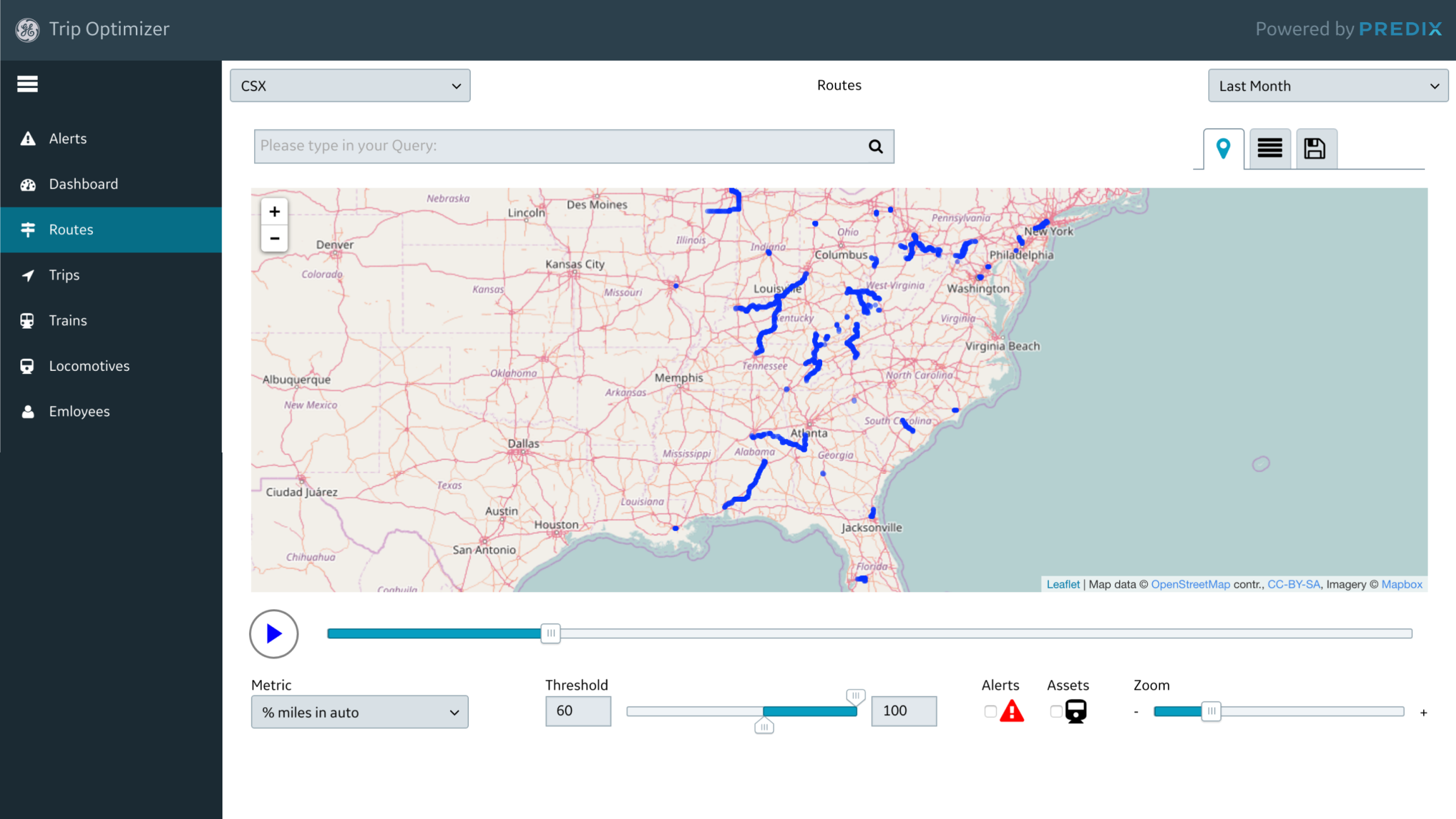
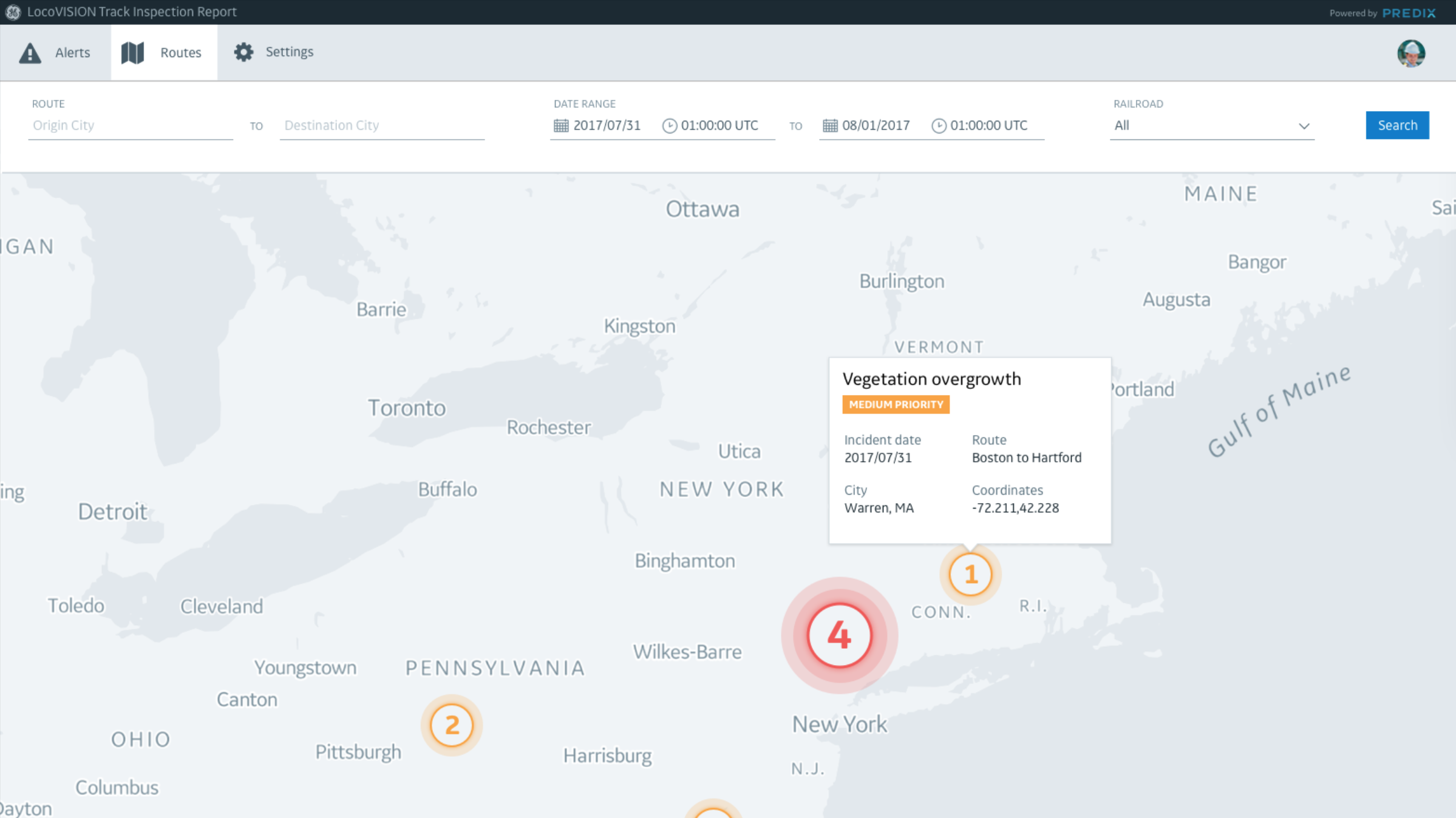
Every tool in the GE Transportation product suite used different patterns for the same components, which caused friction between systems and increased time necessary to upgrade. Maps, trains, yards, cranes, and alerts all had different styles across the GE suite of products.
the goal
Create a unified Design System for the GE suite of transportation software solutions to increase communication, visibility, and align experiences across products.
GE Transportation product suite prior to redesign
The process
To understand the current state, I collaborated with our UX researcher to run a two-day stakeholder workshop. We conducted interviews with users and compiled existing research across tools, grouping common themes as we came across topics from various users.
We assembled hundreds of screenshots in an audit of over 30 of our products. Through this process, we were able to identify opportunity areas. Mapping and iconography quickly emerged as components of our product suite that would have a major impact on our products. By starting with these elements, we were able to create geographic track abstractions and transportation iconography that could be reused across our entire product suite. Trains, tracks, railcars, cranes, drivers, switches, and signals were the main components that we focused on for the first release of our design system.
Examples of existing products from audit
Through this process, we aligned on four core values for the GE Transportation Digital Studio. Our design system needed to be:
Scalable • Flexible • Actionable • Evergreen
We used the Predix Design System as our foundation for the core interface components – principles and basics such as buttons, form fields, error messaging, etc. – and we touched base with the Predix design team throughout our design process to ensure that our vision was aligned to the overall GE vision.
Mapping the rail ecosystem
Trains
Shape ideation + final train components
trains
Animate movement as trains move along tracks. Show differences between freight trains [blue] and passenger trains [gray] as well as train status.
cranes
Show positioning and movement throughout the rail yard, optimizing equipment utilization based on time and place.
Bird’s eye view of a railyard
“Digital twin” of the same railyard using new design system components
Digital studio documentation
Our team built and maintained the GE Transportation Digital Studio, which housed UI patterns, implementation guidelines, and solution spotlights highlighting recent projects.
Example of the map component documentation
Future concept application
Augmented reality using Digital Studio components
Conclusion
Overall, this project was very successful in aligning our suite of products with a unified style and component library.
If I were to rework this project, I would:
Work more closely with accessibility teams
Do additional rounds of research with both stakeholders and users
Continue to explore ways to take steps to build the future of rail


